
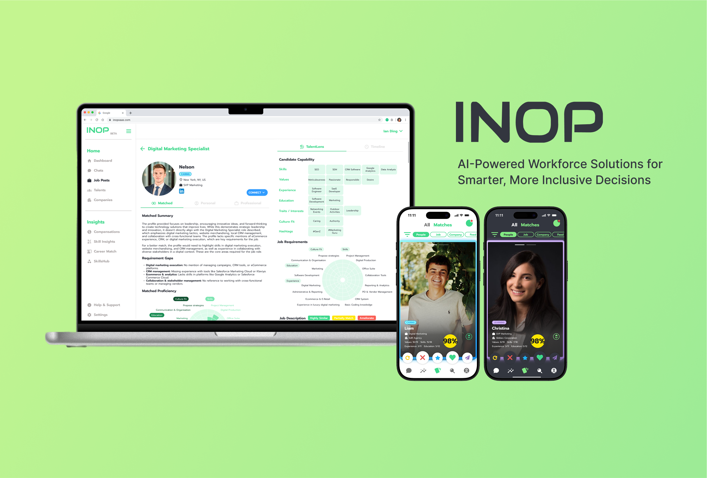
As the sole Product Designer at INOP, I led end-to-end product design for 5 major projects, which are B2C app, B2B SaaS platform, website redesign, Chrome extension, and full brand identity. By uniting user research, UX/UI, and cohesive branding, I delivered a scalable design system that improved usability, streamlined development, and increased user engagement by 47.6% (B2C app) and satisfaction by 50% (B2B SaaS).
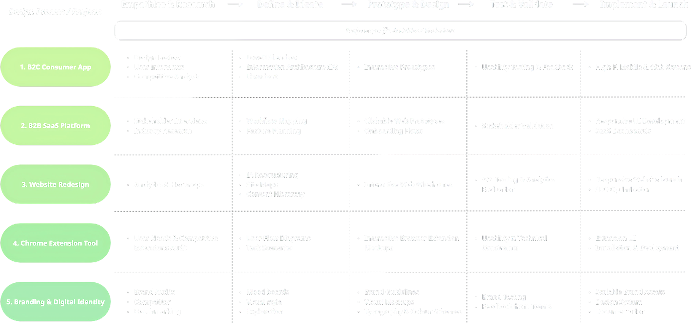
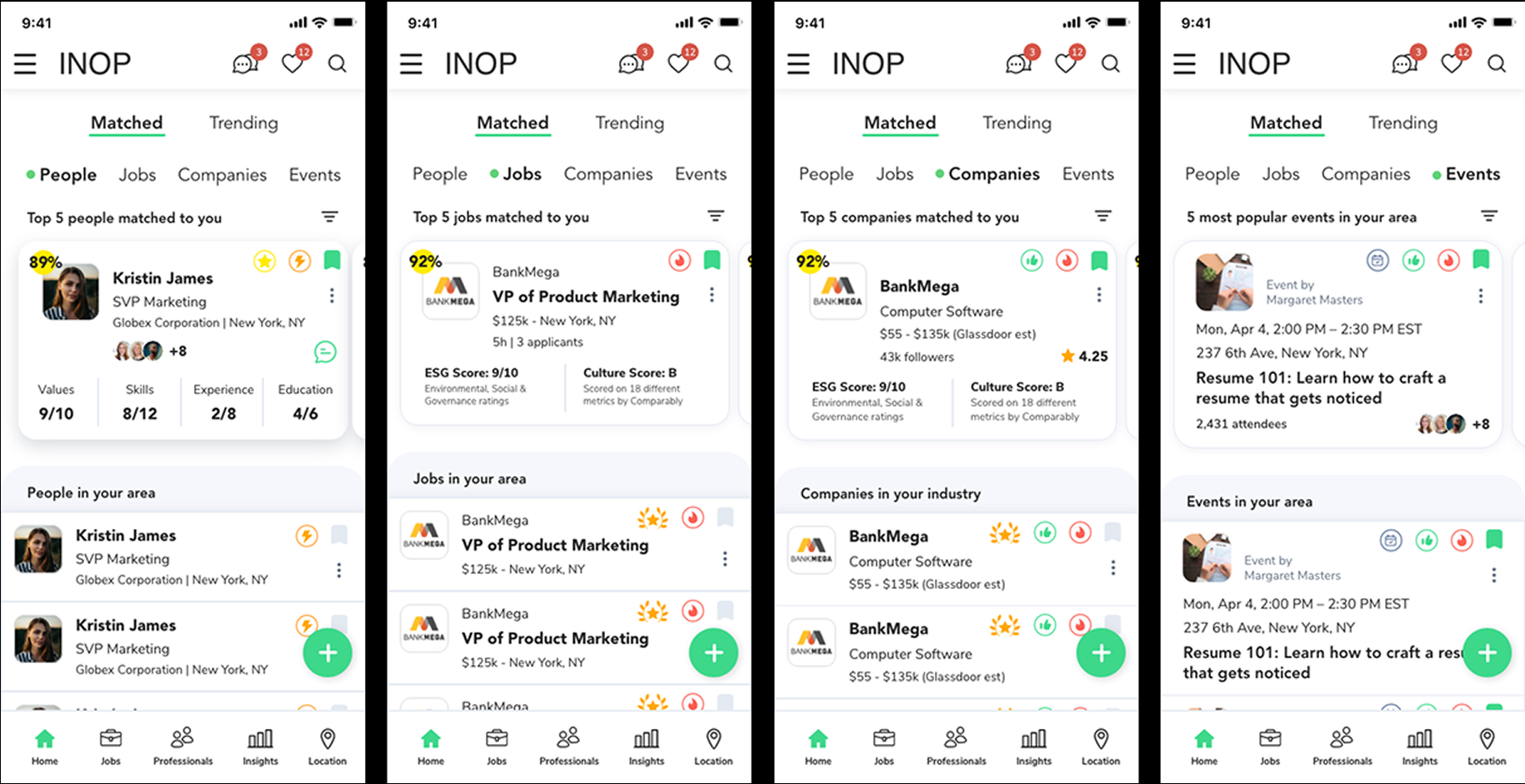
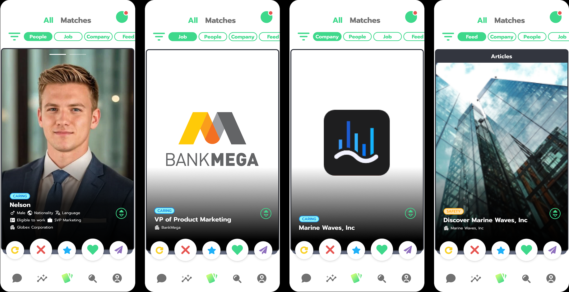
A consumer-facing application designed to enhance user productivity and simplify daily tasks, especially needs to improve the number of user profiles on the B2C app.
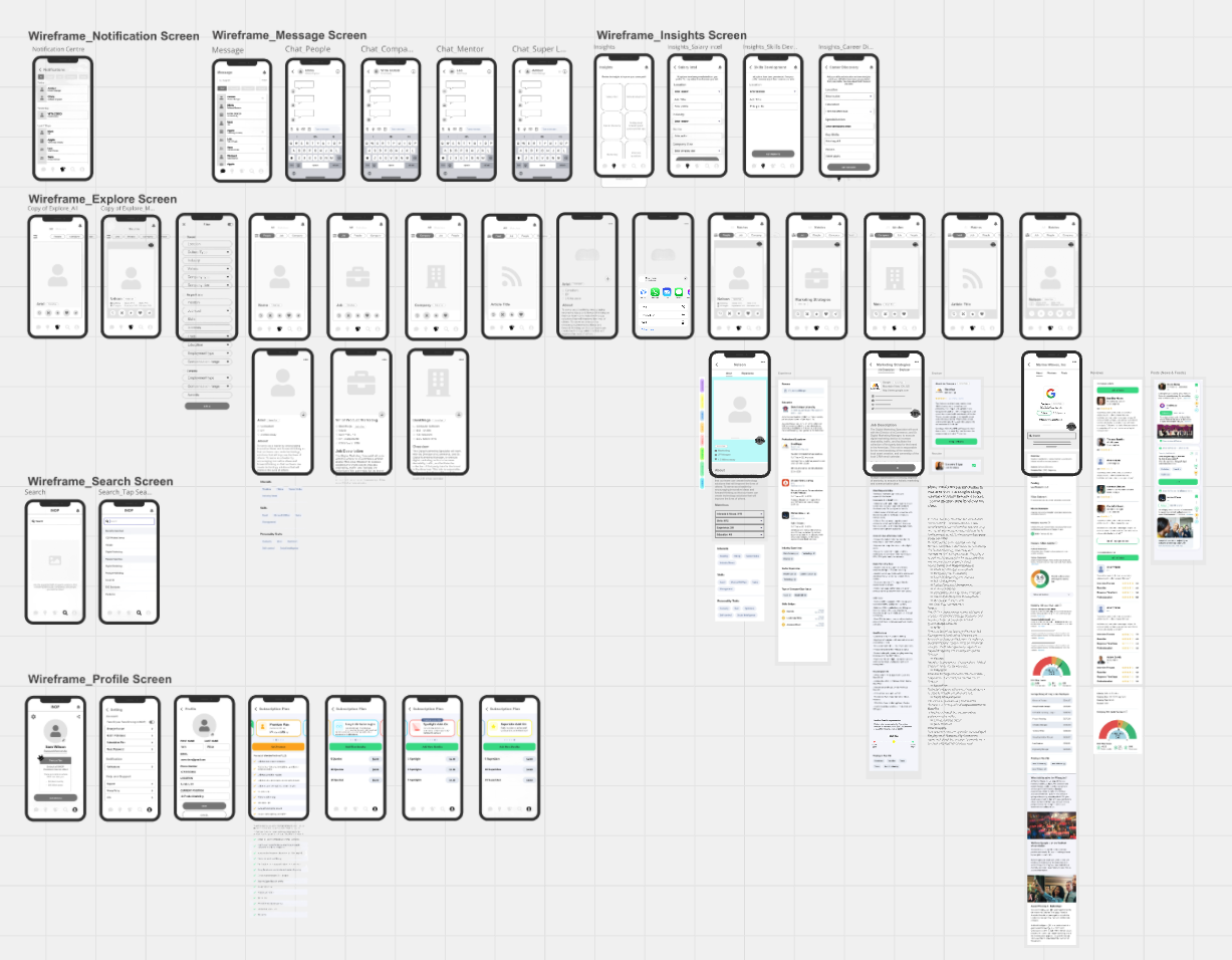
INOP's previous B2C App design lacked clarity and structure, making navigation difficult. Similar-looking tabs and complex flows left users unsure of where they were, reducing overall usability.
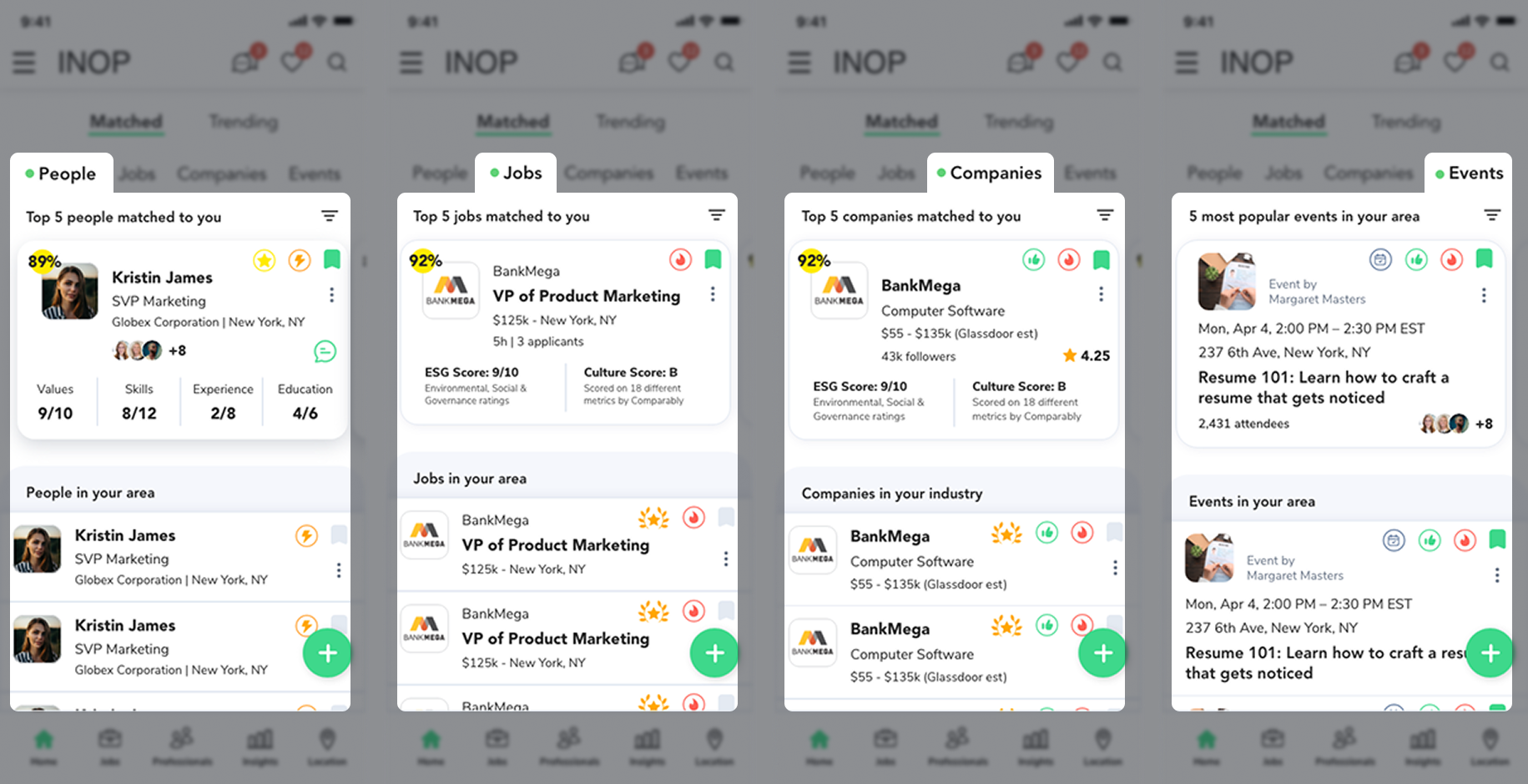
These issues lead to frustrated users, low interaction, and a weakened product experience across the platform.
Complex User Flows (Low User Engagement)
Weak Visual Hierarchy and Inconsistent UI
The comparison below shows the previous design and my optimised version. The new layout makes each category distinct and easier to navigate at a glance, and provides better usability and a clear visual hierarchy. (Slide to view changes 👀✨)
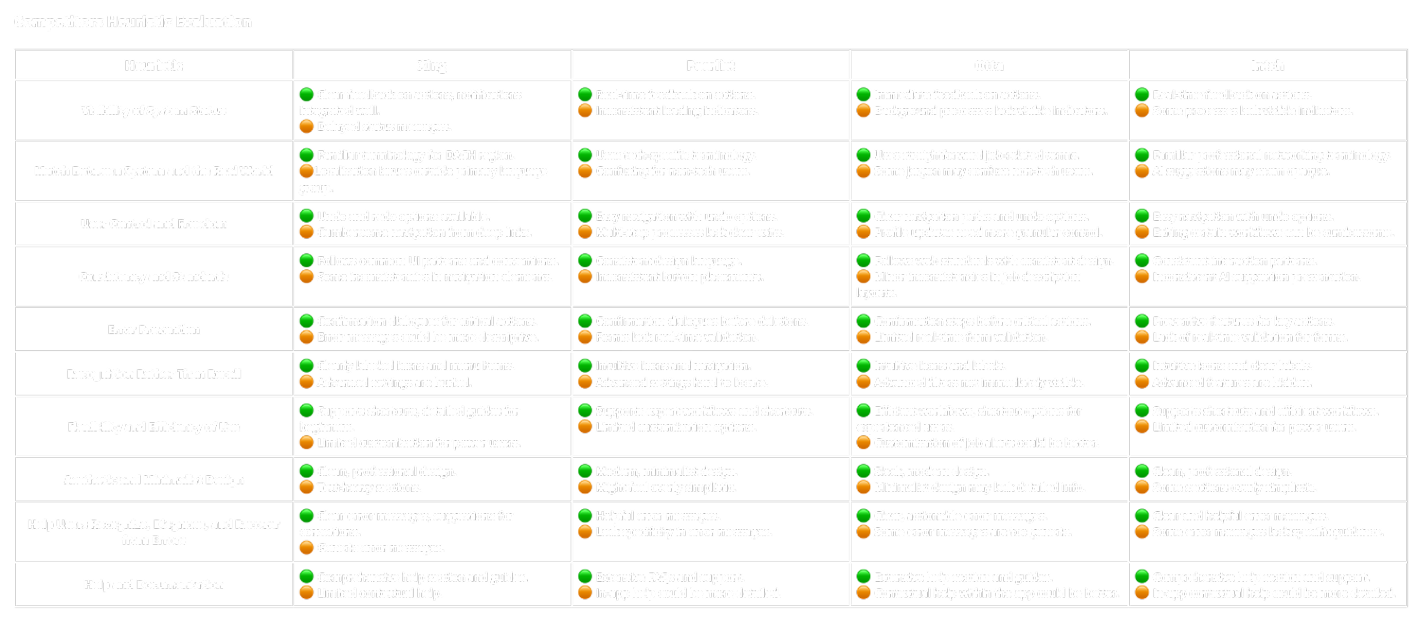
Conducted design review, competitive analysis and competitors heuristic evaluation to clearly define pain points.
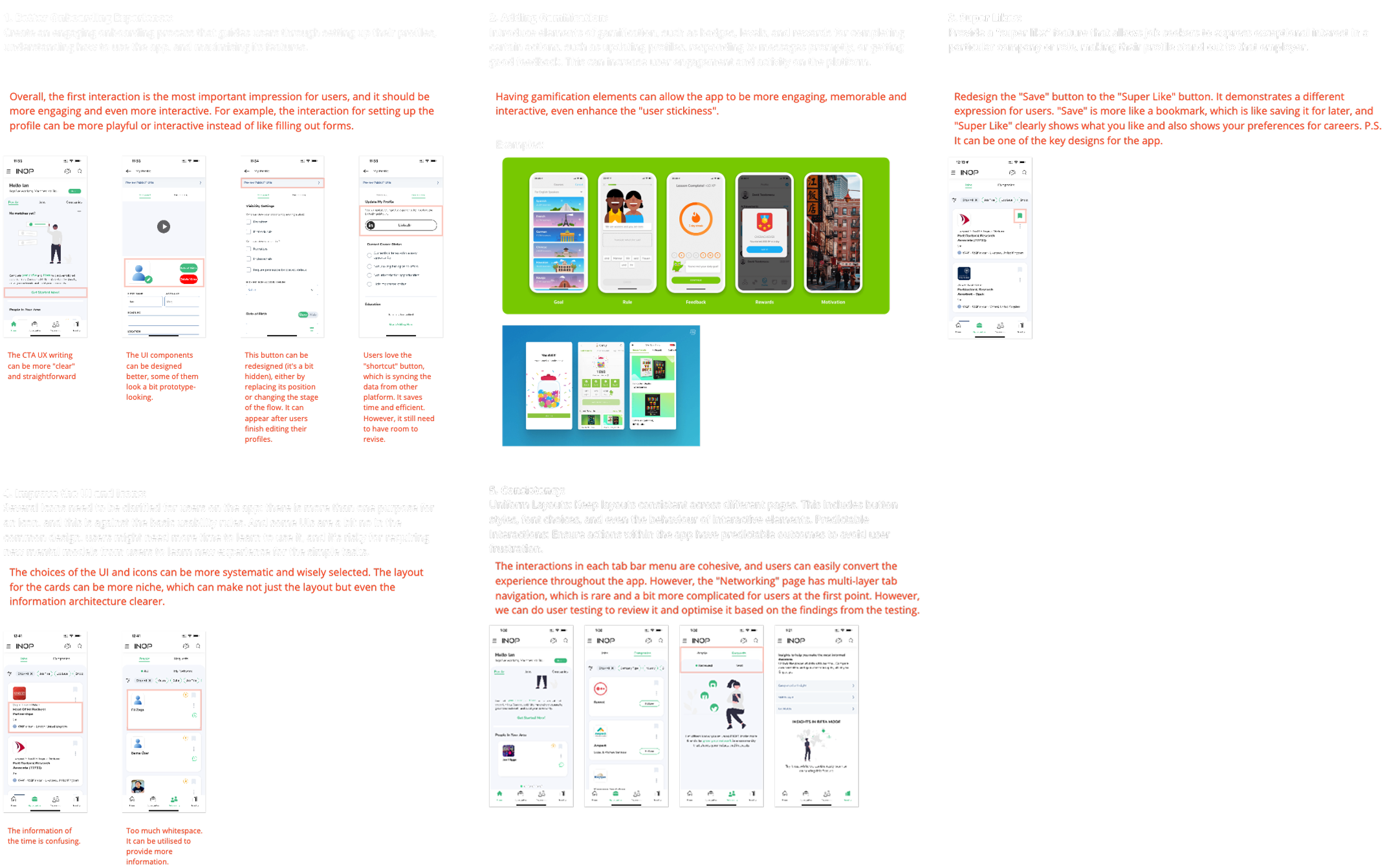
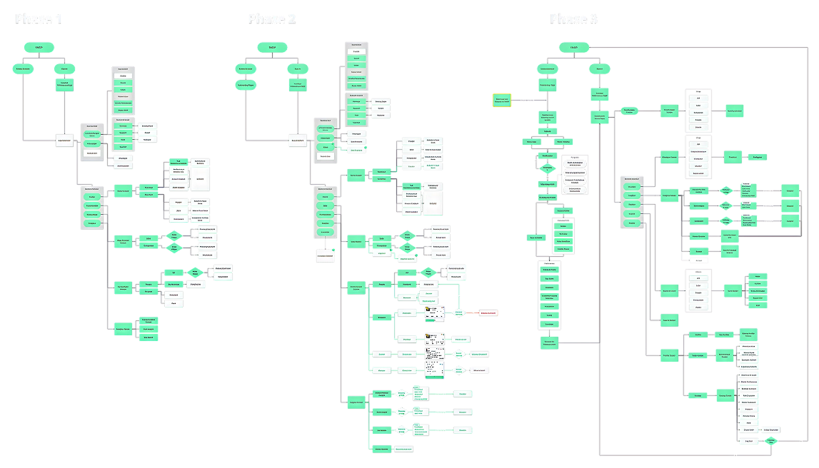
Streamlined user navigation by developing low-fidelity sketches, flowcharts, and improved information architecture (IA), iterated through three defined phases.
Created wireframe and interactive prototypes, refined through iterative usability testing.
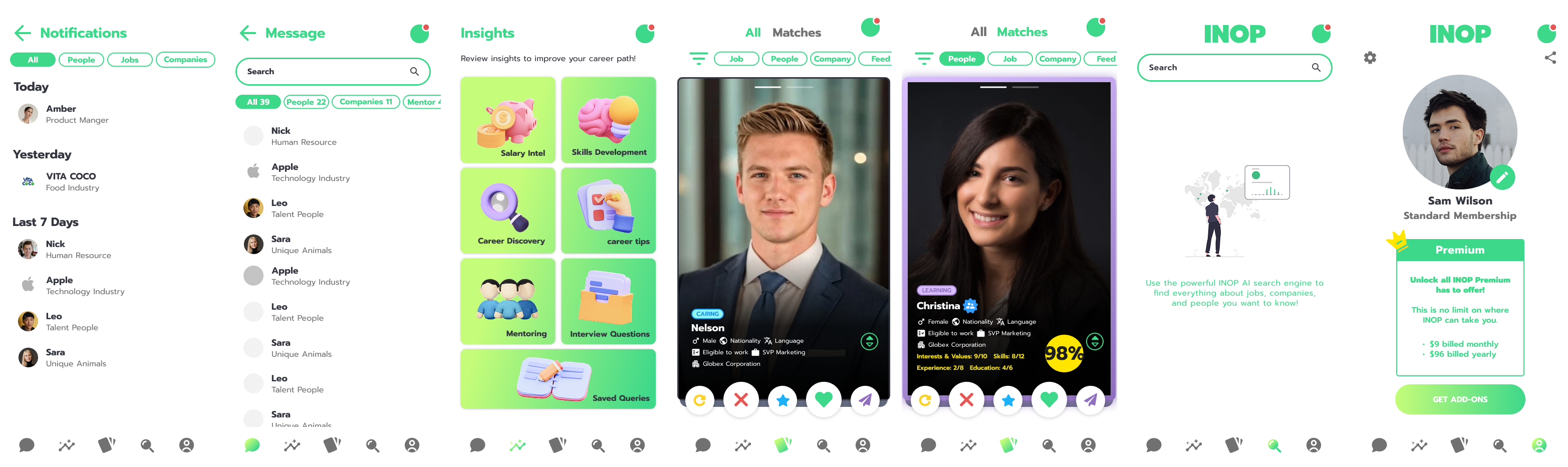
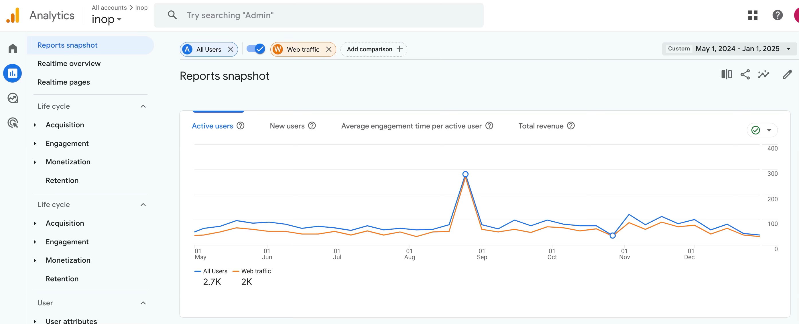
The new design achieved significant usability improvements, leading to approximately 47.6% increase in user engagement.
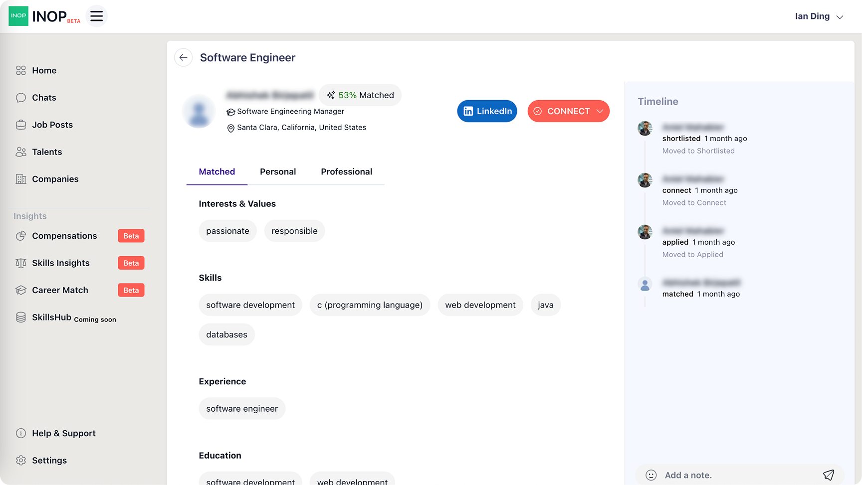
A business-to-business SaaS platform aimed at providing scalable digital solutions and streamlined operations for enterprises. The new design focused on improving recruiter efficiency, simplifying onboarding, and introducing AI-powered templates to reduce repetitive work and improve clarity.
Recruiters faced challenges across the workflow. Reviewing candidates was slow and messy, and communicating with them was repetitive and time-consuming.
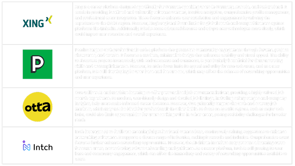
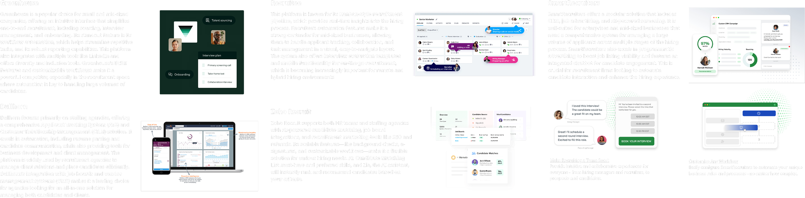
I conducted industry research and a competitive analysis to benchmark usability, navigation clarity, and emerging AI trends in HR SaaS tools.
The research showed that while competitors were beginning to explore automation, very few offered meaningful AI assistance. This gap created an opportunity to differentiate INOP through more intelligent recruiter workflows.
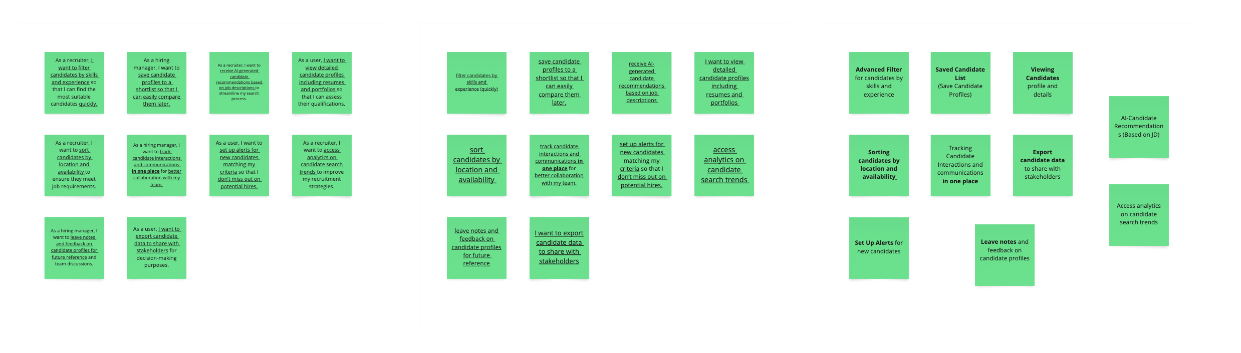
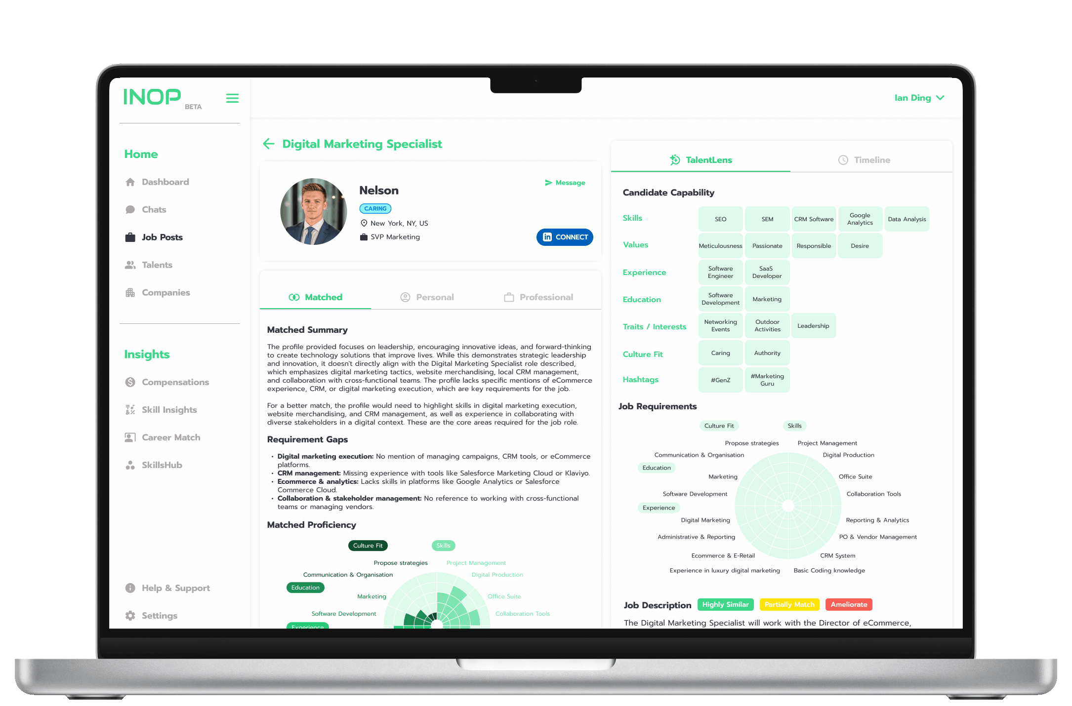
Building on insights, I defined key features for the Career Match Tool and identified the recruiter journey as the critical focus. The workflow naturally started with candidate Profiles, progressed into Chat, and was accelerated by AI-powered templates.
The original SaaS UI lacked structure and clarity, making it hard to scan, compare, or act on candidate profiles. My design brings stronger hierarchy, clearer grouping, and sharper readability, enabling faster decisions for enterprise users. Recruiters could now scan and compare faster, making quicker decisions before starting a conversation. (Slide to explore the upgrade 👀✨)
The Chat function emerged as the most critical recruiter workflow, so it became the foundation of the redesign. I added AI-powered templates that suggested context-aware draft responses, helping recruiters save time, cut repetitive typing, and keep communication consistent.
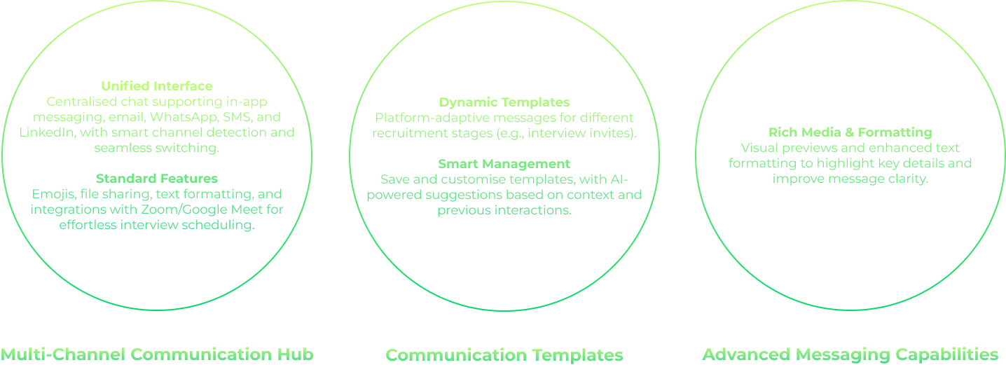
To streamline recruiter workflows, I introduced context-aware, editable draft responses within Chat. These AI-powered templates generated tailored outreach messages that recruiters could accept or refine in seconds. The feature reduced repetitive typing, saved an average of 15–20 minutes per conversation, and ensured a consistent, professional communication tone across the platform.
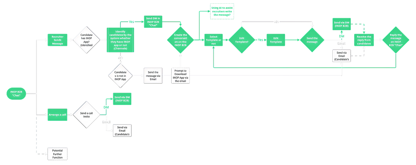
The new Chat flowchart maps the end-to-end recruiter journey with AI integrated as a supportive layer. It demonstrates:
I created wireframes and interactive prototypes that were refined through multiple usability testing rounds.
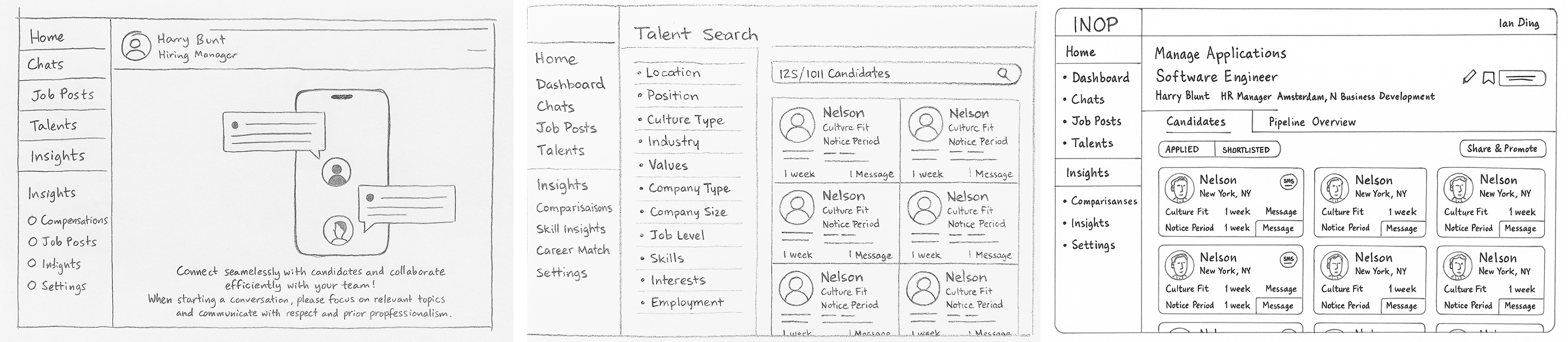
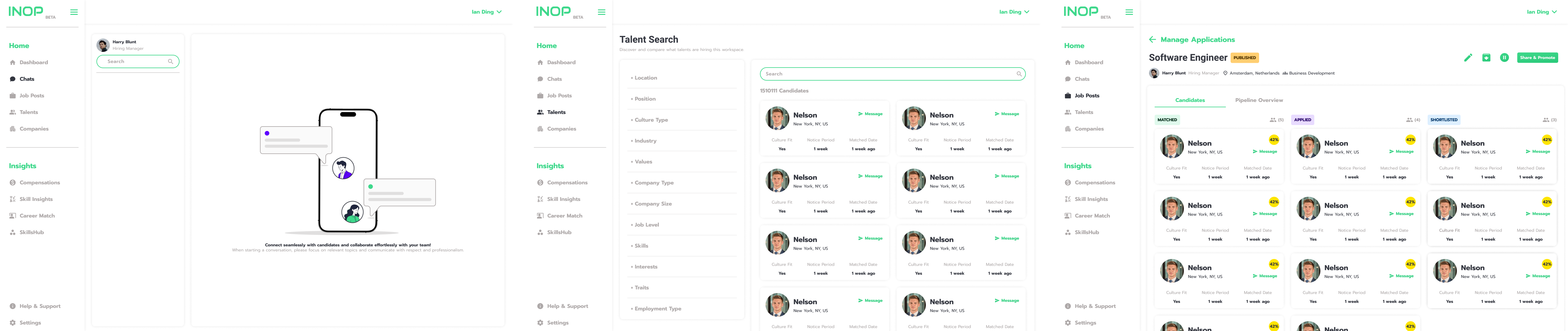
This prototype showcases the redesigned Chat interface, integrating AI-powered messaging templates for faster and more consistent candidate communication. By streamlining repetitive tasks and improving information clarity, the design enhanced recruiter productivity and reduced response times.
The new design improved usability, recruiter productivity, and stakeholder satisfaction.
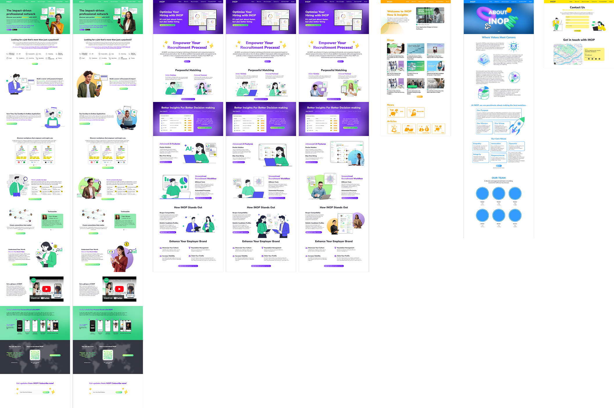
Redesign of INOP’s main website to clearly communicate the company’s value proposition and improve user experience.
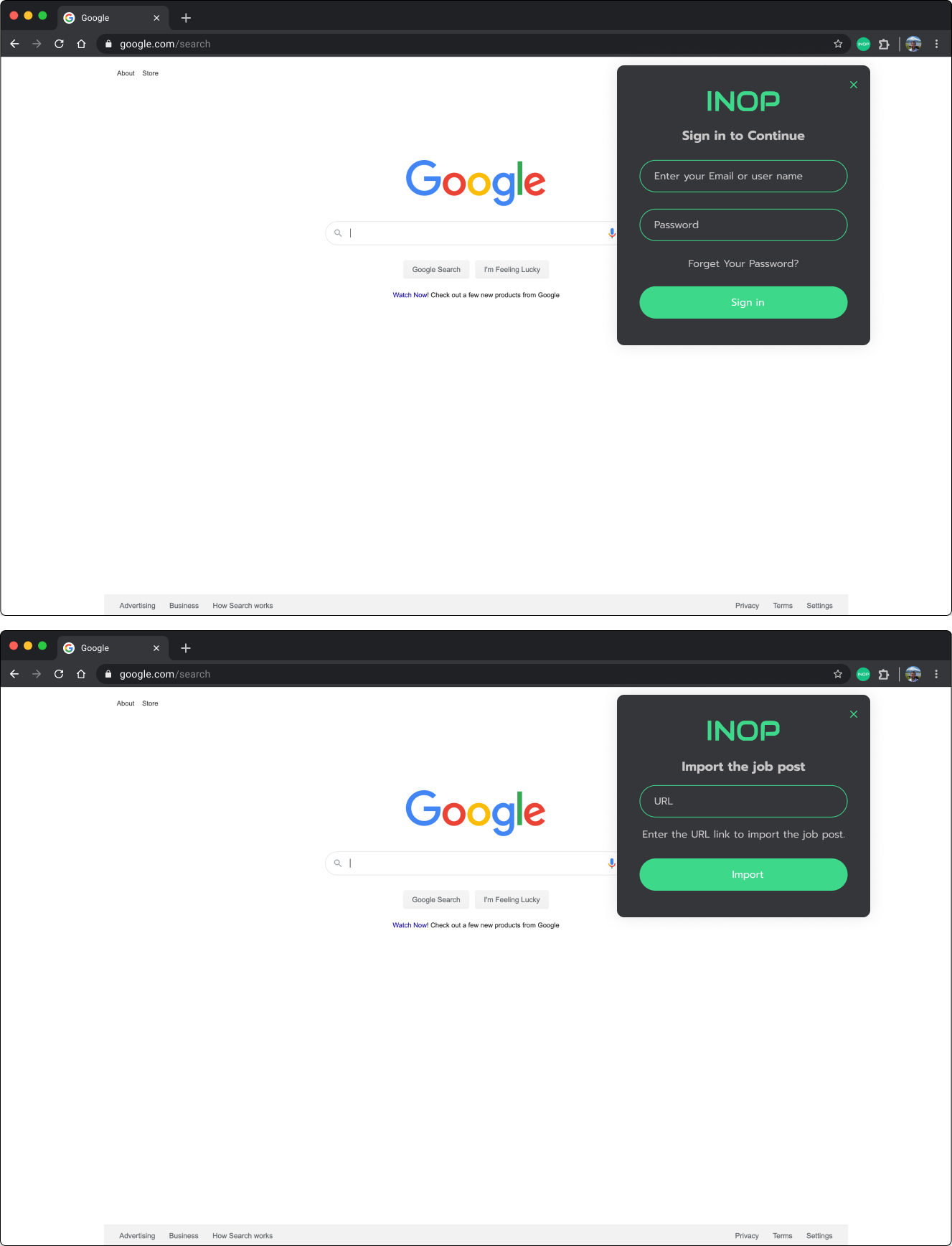
A productivity-focused Google Chrome extension providing users quick access to essential tools directly from their browsers.
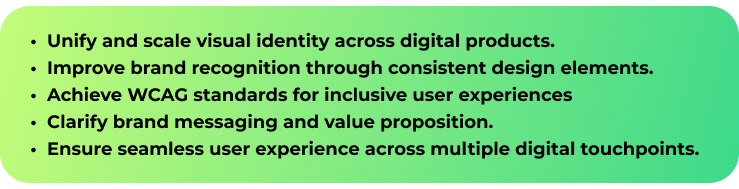
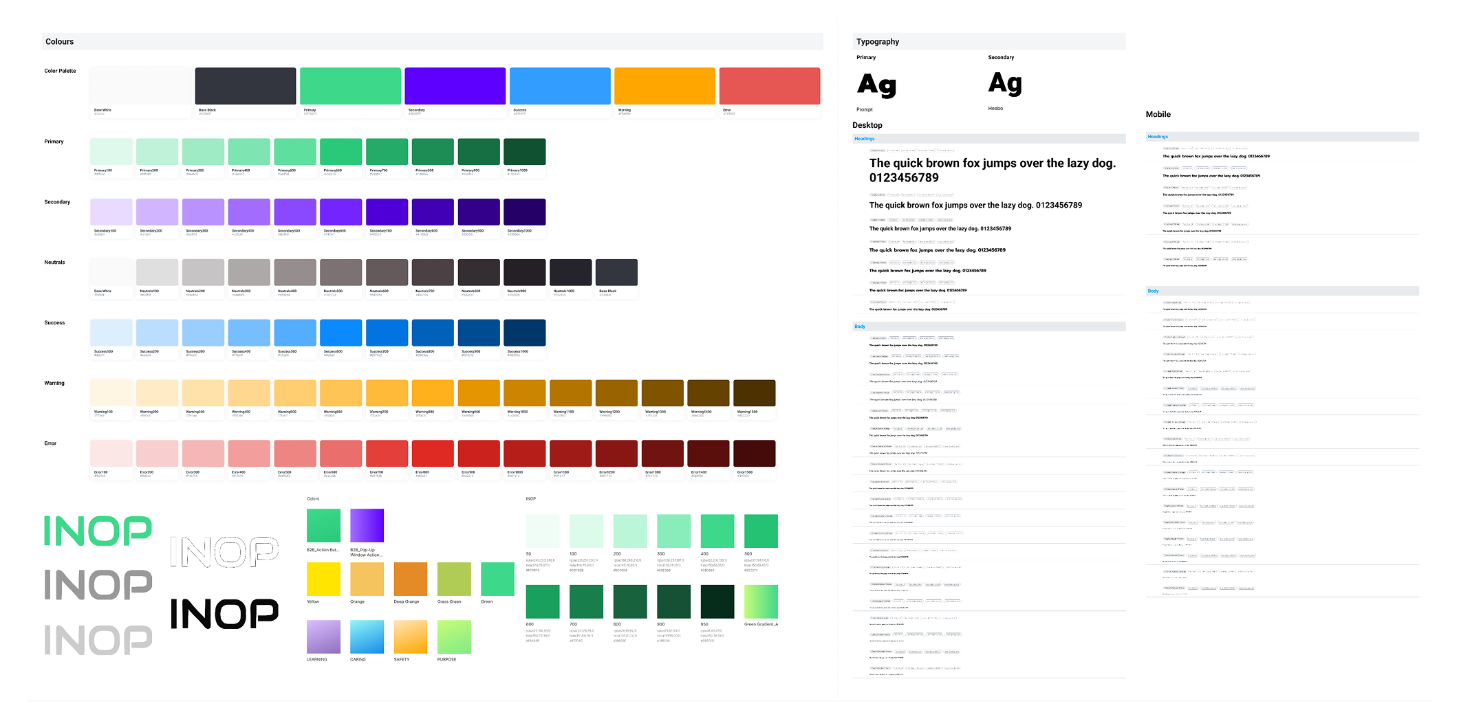
Creation of a cohesive brand identity and digital design system ensuring consistency across INOP’s diverse product ecosystem.
Selected product design work from INOP, highlighting end-to-end process, decision-making, and product outcomes. (Additional context available in conversation)
INOP was more than a 47.6% boost in engagement and a 50% rise in satisfaction. It was a complex, systems-level design challenge. As the sole product designer across consumer, enterprise, and browser-based tools, I had to think far beyond UI, connecting user needs, product goals, and business priorities into one cohesive experience.
Grounded in research, rapid iteration, and close cross-functional work, the project sharpened my instincts as both a designer and a leader. From aligning stakeholders to mentoring teammates through complex decisions, it strengthened my belief in thoughtful, scalable design systems and left me with a deeper toolkit and a clearer vision for the impact I want to create next.
Great design looks good,
feels right, and works effortlessly.

.png)